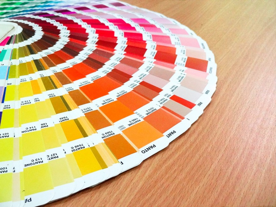
Color palettes are like taste buds, only much more permanent – which is why designing a home is sometimes a task that engenders both anxiety and optimism.
“Gray has been the new neutral for over a year,” explained Kimberly Tall, interior designer for Aiden Fabrics. “The accent colors people are opting for tend toward teal, burnt orange, lipstick red or salmon colors.”
Tall, whose design career was launched in California, noted the differences between the two coasts.
“California is more eclectic and earthy, with a little bit more edge. Also, design choices tend to change more often,” she explained. “The East Coast, especially in Charleston, sticks with a traditional foundation mixed with chic and beach.”
People tend to stay with what reflects their personalities, according to Tall.
“I’ve even seen people choose throw pillows that match their favorite shirt,” she said.
Jenny Keenan of Jenny Keenan Designs, who has been in business in the Charleston area for more than a decade, sees a change in the Lowcountry.
“Things are becoming less formal,” she noted. “People like to mix inherited pieces that are more traditional and then add items that tend toward a more relaxed style to fit with kids – one big open space with an eclectic mix of things with pops of color.”
Color forecasters around the world get their inspiration from many different avenues, including runway fashion and even automobiles.
“People listen to the color forecasters, but often times design trends have been pulled from different countries, such as Old World or European,” Tall explained. “A popular choice lately is white on white with textured cream leather.”
Incorporating patterns and designs is a way for you to make a house a home. Feeling comfortable in your space is important, and, for most, it means redesigning every 10 years or so.
“A great way to live within a budget is to utilize neutral colors such as beiges or grays for your bigger pieces and then accent with the livelier colors,” said Tall. “That way you aren’t trying to replace an expensive sofa. Think about replacing throw pillows or lamps to change your living spaces.”
Keenan agreed. She is a big fan of working with a white house and adding fabrics to create individualized living space.
“I love block print palettes,” she said. “Essentially, you can just continue to layer patterns over patterns. I love mixing textiles.”
It is important to choose a color that makes you comfortable, and, if you are concerned about using a specific color, you should start small.
“Add little pieces in one room, and, if you find you like it, then expand to another room,” said Keenan.
She also recommended choosing a paint color with gray undertones.
“Of course, it depends on how vibrant you want the color to be, but having a gray undertone doesn’t mean it is going to look gray on the wall. It simply translates better and is not quite so bold. My clients seem to be happier with this. What color people want most often is a good blue,” she said.
When choosing a color, Keenan said you shouldn’t simply go by the small color samples or color wheels: “Paint a test sample on a board – or several samples – and then carry it around the room to see if it is going to work.”
For many, one of the most important rooms to design is a nursery. Winn Query, owner of Baby Bloomers in Mount Pleasant, has been guiding clients for nearly 13 years, helping them make sure the room will be ready when the baby arrives.
“Neutrals and grays are definitely trending in nurseries, but white is still the most popular color choice,” said Query. “We always start clients off with furniture pieces because that is the biggest decision yet the easiest for people to make. There are fewer options in color tones in regards to furniture. Then we move on to fabrics, such as chevron, which was popular a few years ago, and from there the client’s tastes will guide them in the proper direction.”
While the furniture pieces and wall colors are typically guided by the tastes of the parents, the remaining colors that add the pizazz and character have for decades been dictated by the sex of the child.
“For both male and female babies, adding pops of color to the neutrals and grays is important. Even today, pink is most often chosen for girls and blue for boys,” Query explained. “However, a common mistake is getting too many things going on at one time. Add one bold pattern and then build around it if that is what you want. Although, not everyone wants bold for a nursery, and that is why we are here.”
Popular gold and metallic embellishments have stayed the course for a few years, as has earthy, raw or rustic tones in nurseries. Inspirational words or phrases placed around nurseries have also remained popular, while vintage floral patterned wallpaper or decals seem to be making a comeback.
Some Lowcountry nurseries also seem to work with furniture pieces and accents that work for both sexes: deep blues, raspberry or even kelly green.
The impressions colors make reach beyond the interior of the house: The exterior is the first statement made about a home. Jan Clouse, owner and president of Carolina Lanterns, has seen changes since starting her business.
“In 1999, the most popular color was black, but today people have expanded to more traditional lanterns with copper,” she said.
Clouse went on to explain that a house with copper gutters, roof and lanterns is a wonderful choice: “Nothing says quality more than copper on the exterior of a home. It is the only thing you can put on your house that gets better with time.”
Copper turns naturally, offering an exquisite patina that goes through several stages of color, she added
“In the Lowcountry, you can pair it with Charleston green, which is a beautiful shade that never goes out of style,” she said. “It is timeless.”
Story by Stacy E. Domingo.


Leave a Reply